James Brook / Design

Perspectives Issue 4

Perspectives Issue 4: Language and Culture

Published by Haileybury, 2023 

Editor: Toby Parker 

Contributors: Gary Wade

Designed by James Brook 

210mm x 245mm | 112 pages | Printed by Gomer, Wales on 150 gsm Edixion Offset with 300 gsm machine-sealed soft cover and 150 gsm wraparound jacket with 200mm flaps

This is the fourth issue of Perspectives, a magazine that I have designed from the first issue, creating a flexible but rigourous design and layout that subtly shifts and develops with each issue. The magazine is published by Haileybury School and was initiated from a desire to showcase the school’s heritage, current academic and cultural issues with new research about the school’s collections. Edited by Toby Parker, the Heritage Director and College Archivist at Haileybury, the magazine examines the school’s role in a variety of cultural practices and issues, and to think critically about the way in which it interacts with other cultural institutions locally, nationally and globally. 

Perspectives is published several times a year; each issue is themed, with this one titled ‘Language and Culture’. This special issue is the biggest issue to date with 112 pages and breaks away from the magazine format of previous issues – which were based around a series of articles and essays – with most of the publication taken up with the first edition of the Haileybury Lexicon or Haileyburiana Redux. The Lexicon consists of over 1,000 entries relating to vocabulary used between 1862 and 1942 at Haileybury, and demonstrates the complex culture of the School in its first 80 years. Words and phrases, most of them cross-referenced with other entries, offer insights into the social hierarchies, humour, cruelties and the general intricacy of the culture that existed before the mid-twentieth century. 

It was an interesting challenge to take the design and layout of the magazine – established in the previous three issues – and push it in a totally different direction. I generated sample layouts and designs that explored how the essence of the design could be kept whilst accommodating a very different type of information than the essays and self-contained articles published in previous issues, refining these ideas in consultation with the editor, Toby Parker, over a period of time. The layout of the Lexicon entries uses the same typeface, Calluna, as in the previous issues but, for the Lexicon, it is used exclusively in its serif version to echo the authority of a dictionary. Individual entries in Lexicon are typeset in different weights and styles of Calluna to establish a hierarchy of information and to assist the reader in understanding the conventions of the cross-referencing system set up by the editor. Once the Lexicon had been typeset and everything was in place, we became aware, as we proofed, corrected and cross-referenced the entries, that the contrast between different types of information needed to be stronger so I refined this hierarchy further.  

Alphabetical sections are marked by over-sized letters printed in ‘Lexicon Red’, an additional colour to the four colours originally created for the magazine. This colour was then used throughout the magazine alongside ‘Perspectives Gold’ to create a cohesive design. Initial sample layouts included images within the Lexicon entries but we decided that, in this issue, the text was the most important element so images were kept on separate pages to maintain the integrity of the Lexicon entries. Initial layouts included far more images which were, over several iterations, whittled down to just the very key images – this introduced more white space which offsets the density of the text of the Lexicon and gives the reader a space to breathe whilst also punctuating the entries.

The editor felt that, although the Lexicon is presented within issue 4 of Perspectives, it should also feel self-contained, as a publication in its own right, so, as a solution, I proposed a jacket with flaps in addition to the cover. The design of the jacket follows the design of the previous three covers of Perspectives, maintaining a cohesive and recognisable series. ‘Perspectives Gold’ was used as the key colour for the cover, the fourth colour from the palette of colours I created for the magazine, which sits well with the colours of the cover illustration. With the extra bulk from the 112 pages, we were able to include the title of the magazine on the spine – previous issues were too narrow to include this. The jacket wraps around the actual cover of the magazine which has a design that highlights the Lexicon as a complete publication with the title on the front and on the spine following conventions of traditional book design rather than magazine design. Information such as the editor’s introduction and the colophon are placed on the front flap; when the flap is removed, the magazine immediately feels more like a book with the first page acting as a title page. We imagined that some readers might not remove the jacket but, for those that did, not only is there the slippage between magazine and book but there are a couple of illustrations from the Haileybury archive, hidden on the inside back and front covers, that are revealed only to curious readers. Similarly, the tint of ‘Perspectives Gold’ that is printed on the inside of the jacket, a contrast to the white paper, can only be seen if the jacket is taken off. 

The client and myself are really pleased with the design of this issue and I think that, once again, it proves the versatility of my original design and layout of the magazine. 

Click here to see Perspectives Issue 1


From the Archive: Bernat Klein Poster

This is a poster that I designed for Dovecot Gallery in Edinburgh almost ten years ago; it was commissioned for an exhibition of the work of the textile designer and artist Bernat Klein that ran during the Edinburgh Art Festival in 2015. This was the third time that I had used this poster layout in what was gradually becoming a cohesive graphic identity for Dovecot that was eventually rolled out across other items that I designed including posters, invitations, banners, and the Dovecot What’s On guide. Working very closely with Lizzie Cowan, the marketing manager at Dovecot, I developed the identity from the bare bones of a pre-existing set of logos and a palette of three colours that were already in use at Dovecot: Dovecot rich black, Dovecot pink and Dovecot grey. The Dovecot logo was typeset in Whitney but as the gallery had not yet purchased the license to use it, for this poster and the other print items that I designed with it, I used the freely available and visually similar Callibri instead. 

Lizzie and I both believed that imagery should be prioritised in the layout of the printed material that we were developing: the image on this poster – a detail of a colourful and highly textured tapestry by Bernat Klein, Scandia – created in 1971, appears in a wide band that is bled at the left- and right-hand edges; it is the dominant element in the layout. Below the image is a deep white band that contains all of the typographic information including the exhibition title and logos; above the image is a narrower band that holds the Dovecot Gallery logo. I made a decision to keep information such as the exhibition title, dates, opening times, captions and logos on a white background to avoid the problems of legibility and readability that can occur when these elements are laid over an image – the use of white space became a distinct feature of the identity as it developed. 

The elements of the Dovecot Gallery logo (text and thumbnail sketch of a dovecot) are ranged left so it seemed rational and correct to align it to the left of the poster; reading left to right, the white space to the right of the logo is animated by the ragged right edge of the logo – if the logo is placed on the right-hand side of the poster, it doesn’t have the same dynamics because the ranged left elements of the logo create a strong vertical element and the space on the left of the logo becomes a dead space rather than an animated space. Even though the logo isn't the largest element in the layout, it is given a very strong presence by being surrounded by a generous amount of white space and by the fact that the logo is the only place where Dovecot pink appears, creating a pop of colour that attracts the eye. 

The typographic information that appears in the wider white band at the bottom of the poster was adapted for each exhibition. Typography was always ranged left with a ragged right and was usually printed in rich black only. Certain elements, such as the Dovecot address, contact details, and opening times were always treated in the same way to create consistency and to reinforce the identity, but the title of the exhibition and dates were treated differently for each exhibition, using a mix of upper and lowercase, different weights, sizes and arrangements of the typeface to create visual variety and interest within the more static layout. Seen as a set of posters, this combination of consistency and variation created a visually connected and playful series that became instantly recognisable as being a Dovecot exhibition.

As part of the brief for this project, Dovecot showed me items from the Bernat Klein archive including examples of the company’s space age packaging with their innovative use of plastics and cutting-edge graphic design. Bernat Klein, as a forward thinking designer, used sans serif typefaces such as Akzidenz Grotesk, Univers and Helvetica as a signifier of modernity; the obvious solution would have been to use one of these typefaces for the poster but, in keeping with the nascent identity I was developing for Dovecot, I used Callibri in a way that captured an idea of modernity, with Klein’s name in a combination of upper and lowercase as it appeared on his company logo. The title of the exhibition is set in uppercase italic which has a futuristic, forward-moving urgency to it – a subtle reference to Malcolm Garrett’s classic 1981 logo for Duran Duran’s first album which, in turn, was referencing the futurism of the 1968 science fiction film Barbarella in which the character Durand Durand appears. There was a further nod to the space age on the private view invitation where the exhibition title was printed in a spot colour of metallic silver – on the poster the title is printed as a silvery grey tint of (rich) black. 

In all the subsequent posters that I designed for Dovecot, the layout remained the same as this one. The Dovecot logo remained in the same position and other elements were never added to the white band at the top of the poster. This placing of the logo was applied to other items that I designed for Dovecot and this consistency of placing, along with the liberal use of white space and prioritising of imagery combined with considered and rational typography – all established in this poster – created a distinct and identifiable brand for Dovecot, firmly positioning the gallery on the contemporary art and design radar.

Below is a square advertisement designed for the RSA magazine that shows how the basic design could be adapted for different uses. At the bottom is the private view card with metallic silver spot colour printed on a heavyweight uncoated bright white card.


Manipulate Festival 2024

Manipulate 2024 is Edinburgh’s international festival of animated film, puppetry and visual theatre, bringing the very best of international and Scottish work to audiences across Edinburgh and beyond. This is the second time that I have worked with Manipulate Arts, the organiser of the festival, designing marketing material including a programme guide, posters of various sizes, advertisements, digital posters, vinyls, and a ‘takeover’ of The Skinny website. 

The first three images are digital screen posters installed at the Festival Theatre, Edinburgh and the last two images are A3 posters and a large vinyl installed at the entrance of the Studio Theatre, Edinburgh. Find out more about my work for Manipulate 2024 on my previous post.

Find out more about the festival here: www.manipulatearts.co.uk/festival

Click here to see the posters that I designed for Manipulate 2023.

Manipulate Festival 2024 Posters

This is a series of posters that I designed for Manipulate 2024, Edinburgh’s international festival of animated film, puppetry and visual theatre, bringing the very best of international and Scottish work to audiences across Edinburgh and beyond, in February each year. This is the second time that I have worked with Manipulate Arts, the organiser of the festival, and I am delighted to see my designs on posters all around Edinburgh. 

The posters are part of a wider identity that I have designed for Manipulate 2024 that has been adapted across a suite of marketing and promotion items including a programme guide, posters of various sizes, advertisements, digital posters, vinyls, and a ‘takeover’ of The Skinny website. There are three poster designs using three key images from performances from the festival along with a general text only poster.

The starting point for the identity was an animation of the Manipulate Festival logo created by Jamie Macdonald that was commissioned by Manipulate Arts to announce the festival. Taking inspiration from Jamie’s animation, and working with him to create new neon assets in a carefully edited palette of colours, I created a series of cohesive designs that placed Jamie’s glowing neon Manipulate logo over the chosen images on a subtly glowing background along with glowing neon squiggles taken from the general Manipulate Arts identity. 

It’s always a pleasure to see posters designed on a screen as objects in the real world, but this year has had an unexpected pleasure: when the Manipulate posters are seen alongside posters from Pink, Cher, JLS and Bowie, it looks like our colour palette of purple, pink and cyan has (inadvertently) captured the zeitgeist!

Find out more about the festival here: www.manipulatearts.co.uk/festival

 
Click here to see the posters that I designed for Manipulate Festival 2023.


Alberta Whittle: create dangerously

Alberta Whittle: create dangerously

Designed by James Brook for National Galleries Scotland, Edinburgh, 2023

This is an identity I designed for the exhibition Alberta Whittle: create dangerously at Modern One, National Galleries of Scotland, the largest showing of the artist’s work to date. The exhibition included digital collages, watercolours and new paintings and was an opportunity to see the artist’s tapestry, Entanglement is more than blood, and film installation, Lagareh – The Last Born, which the artist presented at the Venice Biennale in 2022, commissioned by Scotland+Venice.

The A0 poster was the starting point for the identity and is based on brand guidelines developed by DNCO, a branding agency based in London and New York. I was asked to develop three possible routes for the design using the new logo, brand colourways and bespoke typeface, Caslon Doric NGS. This was the first time that the branding had been put in to action and formed part of the National Galleries of Scotland major rebrand for 2023, which went live at the end of March, just before this exhibition opened. 

Working closely with the NGS marketing team, the curators of the exhibition, and the artist and her gallery, I developed and refined three design approaches, eventually settling on one featuring the visually arresting still taken from the artist’s film, Lagareh – The Last Born as the lead image (this was my favourite image and the strongest of the set of images I was given to work with, so I was delighted everyone got on board with it).

Once the design of the poster had been finalised I adapted the design to fit the other elements of the brief: a totem (free-standing signage board), 800mm wide x 1510mm high; a private view invitation; and a roadside hoarding, 17,600mm wide x 1220mm high. The posters, hoarding and totems were produced by large format digital print and signage specialists Mackinnon Slater in Edinburgh, and I was very grateful to Colin Mackinnon for his help and advice during the production of the assets, especially the hoarding which is possibly the widest item I have ever designed!


End of the Glacier by Alyson Hallett

End of the Glacier

Alyson Hallett

Published by the Wilhelmina Barns-Graham Trust, 2023

Designed by James Brook

ISBN 978 1 7384 111 0 8

Soft cover | 210 x 148mm | 32 pages | Printed by Gomer Print, Wales, on 140gsm Edixion Offset with a cover printed on 250gsm Edixion Offset

End of the Glacier is a collection of 27 poems by Alyson Hallett written in conversation with the work of Wilhelmina Barns-Graham. 

Buy the book here.

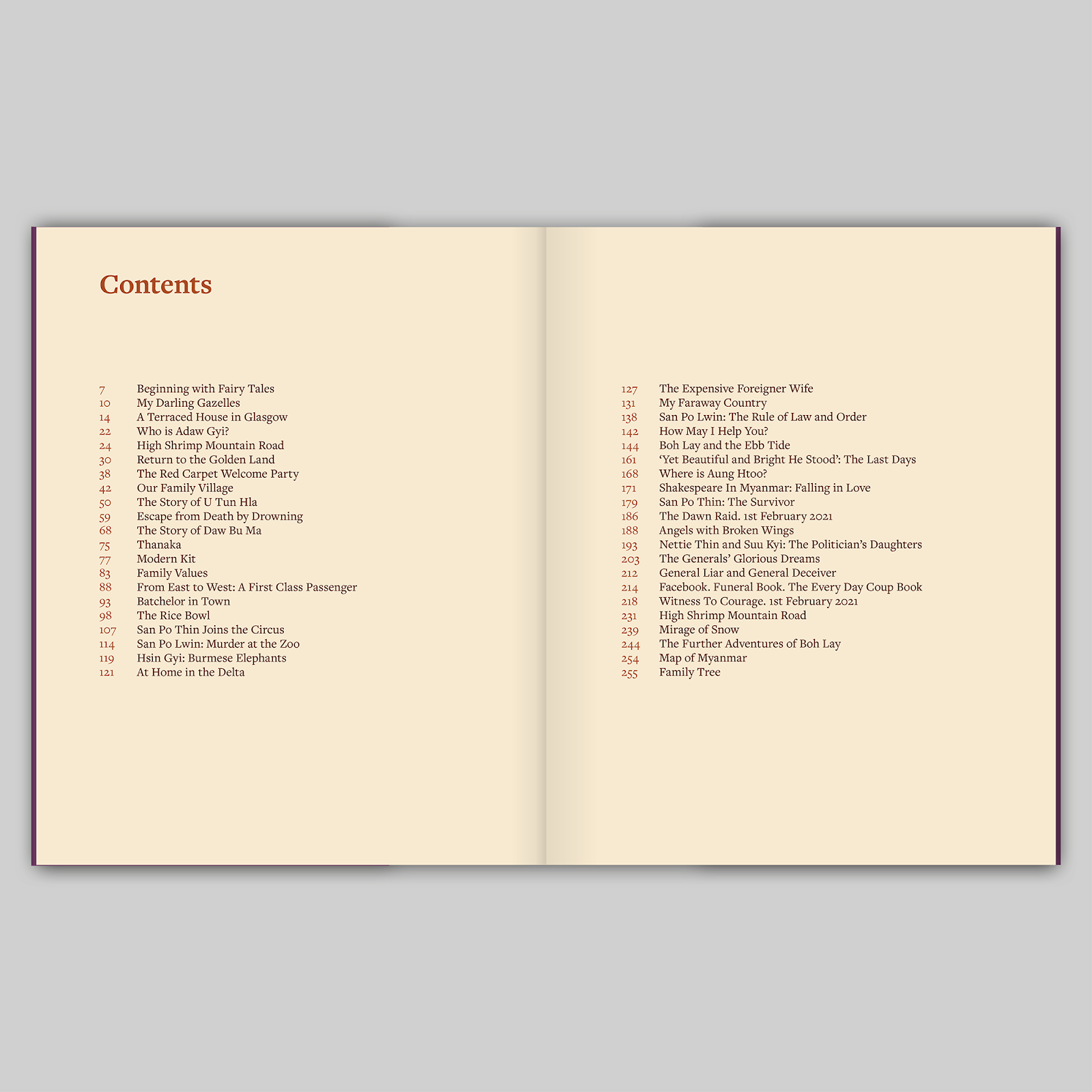
My Faraway Country: Myanmar by Linda Lewin

My Faraway Country: Myanmar 

Written and illustrated by Linda Lewin

Published by Golden Hare, Edinburgh, 2023

Designed by James Brook

ISBN 978 1 8384 0655 4

Soft cover with wraparound jacket | 254 x 203 mm | 256 pages | Printed and bound by Gomer Press, Wales, on 140gsm Edixion Offset with a cover printed on 300gsm Edixion Offset and a wraparound jacket printed on 140gsm Edixion Offset

A series of stories, told by a range of real and fictive narrators which lyrically evoke the childhoods and the adult adventures and struggles of a Karen family in Myanmar, through the twentieth and into the twenty first century.

With vivid and beautiful illustrations, drawn from historic photographs and the work of the artist/author, this book is as illuminating about Myanmar as it is a moving account of an admirably adventurous, enterprising and eccentric family.

A poetic and beautifully illustrated account of a family, its adventures and experience, and their country Myanmar.


www.lindalewin.com

Linda Lewin: My Faraway Country: Myanmar is my first book and I couldn’t be more pleased with the result. James is an artist and an expert in all details of his trade but most importantly he cared about My Faraway Country: Myanmar as much as I did. He was always there to listen and advise when I needed help but I never felt rushed or pressured. If you are looking for someone who knows how to collaborate and if you want your book to stand out from the crowd James is your man.


Archive

Search

Categories

Click here to subscribe to James Brook / Design

Please visit www.jamesbrook.net for more information

The content (content being images and text) of this website is copyright © James Brook
All rights expressly reserved
Powered by Blogger.